Most users decide if they should stay or leave your website in less than one second.
That means you have a fraction of a second where the reader decides to stay or bounce. Your web copy is the best way to keep users on the page. Google prioritises web pages that provide fast, accurate information that matches the reader’s search intent, so that must be your goal.
Over the years, we’ve learned some proven hacks that will instantly improve your engagement and conversions. We’re going to share them with you today.
In this guide, you’ll learn how to:
- Attract attention with your home page
- Build trust on your service page
- Help readers feel ready to take action on your contact page
- Shape expectations using real search results
- Support your message with a layout that holds attention
Let’s dig into what makes website copy work.
Copywriting for a Home Page That Converts
Homepage copy needs to be clear, warm, and structured to guide attention and action. It must meet the customer exactly where they are and entice them to stay.
Here’s how to do it right:
Say what you do right away
Your headline should answer the questions every visitor has. That’s why your content should immediately let viewers know who you are, what you do, and for whom it’s intended. To achieve this, avoid using fluffy language or brand taglines. Write in plain English, the kind your customer would say out loud.
For example: “Custom Websites for Allied Health Clinics in Brisbane.” This headline is clear, specific, and speaks directly to the niche. It helps the visitor immediately know they’re in the right place without any guesswork.
Give your visitors a reason to stay
This is your chance to give readers a reason to care. We recommend you tell them what’s in it for them. Will they save time, look more professional, or get better results? Try something like, “We build sites that convert visitors into patients fast.”
A strong subheadline gives context to your offer. It also creates momentum, which leads the reader to scroll or click through confidently.
Show that you’re worth trusting
Place client logos, reviews, or short testimonials above the fold. These help establish credibility before users even start reading your full content. The number one thing your customers care about is trust, and social proof is the way to do it. People want proof that others like them have had a good experience. Over our years of experience, we’ve seen that familiar brands or positive feedback is the best way to gain trust fast.
Make the Next Move Obvious
A CTA, or call to action, is what you want the user to do next. For example, you could have the user click a button, book a call, or view your work.
Why include one? Because users often need a clear idea to take that next step. Otherwise, they leave without doing anything. Use action-oriented copy that feels easy, like a low-pressure next move. Make sure your CTA button stands out visually.
Also, repeat it in more than one place on the page, ideally near the top and again toward the bottom.
A home page shows that people are in the right place. Keep it focused, honest, and helpful.
Write a Service Page That Builds Trust
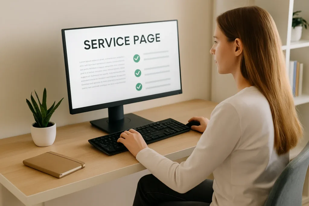
Many service pages feel cold or generic like someone wrote them for a brochure, not a person. A strong service page should guide your reader, answer their questions, and help them feel safe choosing you.
Use these steps to build trust with every section of your service page:
- Focus on what the reader gets: Talk about results, not tools. Use simple phrases that highlight benefits. Let them know what changes after they hire you. Instead of “We write 3 pages,” say, “You’ll get three polished pages that sound like you and connect with your customers.”
- Add real outcomes, not just promises: Use proof from your past work. Say what happened to your clients, and keep it short, honest, and relatable.
- Break up each section so it’s easy to skim: Use bold phrases, small sections, and plenty of space. People don’t read everything. They scan for the parts that matter to them.
- Guide the next step clearly: Your CTA should feel helpful, not pushy. Instead of “Contact us now,” use “Let’s talk about what you need” or “See available packages.”
Now that your homepage and service pages are set up to connect with readers, don’t let your contact page be the weak link. It’s time to make it as persuasive and user-friendly as the rest.
Make Contact Pages That Establish Trust
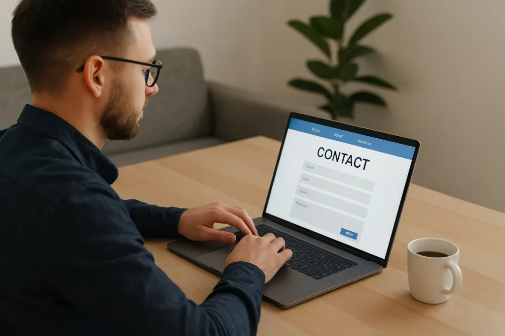
Let’s see what a contact page can do for your website. First of all, this page is where your visitors and potential customers find out how to reach you. It also shows how approachable and responsive your business is in case of any questions or concerns. So, if you can create a well-designed contact page, people are more likely to see your site as trustworthy. That trust often determines whether someone reaches out or clicks away.
Your job is to remove any doubt, make them feel welcome, and guide them to take the next step. Here’s how:
- Open with warmth: We all know that first impressions matter. A simple line like “Got questions? We’re happy to help.” makes your brand feel approachable. When you use friendly language, it reassures visitors that they won’t be ignored or lost in a support queue.
- Clearly say what happens next: People want to know what comes after they hit “send.” Saying, “Expect a reply within 24 hours” sets a clear timeline. Go further and tell them whether they’ll get a phone call, a quote, or a quick confirmation. Removing assumptions reduces bounce and increases form submissions.
- Varied contact methods: Some users hesitate when faced with a single form. So, why limit their options? Include an email address, a phone number, or even a live calendar link right on the contact page. This gives people the flexibility to choose what’s easiest for them and increases the chances they’ll get in touch.
- Design your contact page for action: Ever landed on a cluttered contact page and just backed out? That’s what your visitors will do if the layout feels overwhelming. To avoid that, use white space to separate elements and avoid cramming everything above the fold. Three form fields (name, email, and a short message) will often give you everything you need.
If your contact page is one of your most visited, you need to get people there. Next, we’ll look at how search results shape what people expect before they even land on your site.
How Search Results Should Influence Your Website Copywriting

Search results influence your website copy by changing user expectations before they visit your site. When someone clicks a link from Google, they already have an idea of what the page should deliver based on the title, description, and other results around it. They’ll leave if your copy doesn’t match that expectation quickly and clearly.
To keep them, your page should answer the search query right at the top. Use language that reflects how people phrase their questions. If people are typing “best copywriting for tradies,” your page should clearly say “copywriting for tradies” in the first headline or paragraph.
One thing that helps is to search the keyword yourself before writing a page. Study the top five results. What do they say? How do they structure the page? Use that insight to compose your message and tone. Make sure your basic terms are present where they matter, but don’t overdo it.
We advise you to always write your copy with search intent in mind. Don’t just think about what you want to say. Think about what your reader expects to find when they land on your page. That’s how you write for search engines without sacrificing clarity or trust.
Page Structure Tips to Increase Conversions
Page structure affects how it feels to read, which directly impacts whether people stay, scroll, or take action. If your content looks hard to follow, people are more likely to bounce. But if your layout feels natural and focused, it makes reading, trusting, and eventually converting.
So, start by placing your most helpful message right at the top. This could be a benefit-led line or a summary of what they’ll get from the page. If visitors have to search for value, they’ll leave.
Next, use formatting to create rhythm:
- Short paragraphs (3 lines max) keep eyes moving.
- Subheadings break up topics and help skimmers understand what’s ahead.
- Bolded key phrases make your main points jump out without overwhelming the page.
After doing the formatting correctly, think about how your page flows. Does your call to action appear only once, buried at the bottom of the page? Many pages make that mistake. You can easily avoid that by placing your CTA after your best benefit or main message. Don’t make people hunt for it.
To make your CTA even stronger, place proof right before it. A quick testimonial, result, or review builds trust. When people see what others have gained, they feel more confident saying yes.
Once that trust is in place, make the content easy to absorb. When you list some steps, options, or benefits, you should use bullet points. The bullets break down the long ideas to make them shorter and easier to take in. And when things are easier to take in, your readers can scan and get the message fast, without digging through paragraphs.
In our experience, a clear layout helps copy work better. It makes reading feel easy, helps users know what to do next, and if it keeps them from squinting or rage-clicking, that’s a win.
Writing Website Copy That Feels Good and Converts
The words on your website guide decisions, make impressions, and, when done right, turn visitors into clients.
We’ve walked through writing home page copy that’s clear and confident, making service pages that build trust, and designing contact pages that invite action.
Now, it’s your turn to put these ideas to work. You can start from scratch or improve what you already have. The steps are simple. Know your target audience, structure your message with intention, and let your copy sound like a real conversation, not a pitch.
After conducting experiments with it, we’ve seen how the right copy can reduce bounce rates, improve conversion rates, and increase web traffic, even on a single page.
Need help getting started? Talk to us at DPRConference. We’ll help you write copy that feels right, sounds like you, and gets results.