Your homepage is the most important part of your small business website. Its design and logical elements should convince people to buy from you. But that’s the trickiest part, because the majority of websites only convert 2.35% of visitors, while the best ones convert 11% or more.
We’ve helped hundreds of businesses optimise their homepages and increase their conversions. We’ve seen what works and what doesn’t.
In this article, we’ll show you which homepage elements you need for better results. We’ll also discuss strong headlines, visual hierarchy, and strategies for building trust. You’ll know how to construct each part of a converting homepage.
Read on to learn more about making a homepage that brings in customers every day.
Designing Your Homepage
Your homepage is like your digital front door that defines the mood and tone for every visitor. The best homepages have several main parts to guide visitors smoothly towards taking specific action. These parts tell visitors who you are, what you do, and what they should do next.
When you build a good homepage, it becomes a powerful sales tool. Each part of your homepage does a certain job. And when all the elements work together, people feel more inclined to make a purchase.
We’ll now explain the elements we just mentioned here. Keep reading.
Defining the Essential Elements of Your Site
First, your site needs your main message, which includes a headline and opening text. A good homepage clearly answers a visitor’s first questions within seconds. It helps people decide if they want to stay or leave your site immediately.
The purpose of your headline and opening text is to tell visitors what benefit they’ll get from you. Your headline should grab attention while clearly saying what your business does. Then a short opening paragraph should explain this promise without giving too much information at once.
Put simply, when people visit your site, they shouldn’t have to guess what you do or how you help them. The clearer your message, the more likely people will stay on your site (I mean… unless you’re selling riddles, skip the mystery).
Once you’ve got your main message in place, the next step is making sure people see it properly.
Create an Effective Visual Hierarchy
Visual hierarchy helps guide a visitor’s eyes to the most important parts of your page. Our eyes naturally move in certain patterns when we look at content. Good designers know about it, so they use size, colour, and placement to draw your attention to important messages and buttons.
For instance, big headlines catch your attention first. Then you notice smaller headings and regular text. And bright colours or buttons work well against plain backgrounds. Plus, clever use of empty space gets rid of confusion and makes your page easier to read.
On the flip side, messy pages don’t work well because visitors can’t quickly see the important information on your homepage. So, it’s a good idea to use clean page layouts with clear priorities rather than busy designs with too many things.
Even then, the most beautiful page won’t work without one important thing: a Call-to-Action, or CTA.
Writing Powerful Calls to Action
Naturally, your page’s primary goal is to convince users to do something. That’s why your main call to action (CTA) should be obvious. Use action words to tell visitors what happens next and leave no room for confusion.
Consider buttons like “Get Your Free Quote”. They work much better than boring, generic “Submit” buttons. What are you asking to “submit” anyway? Specificity is the game here.
And we aren’t speaking on vibes. Recent statistics have shown that using specific CTAs can increase your conversion rate by 1.6 times.
There’s one more thing.
You should also add extra CTAs to help users who aren’t ready to commit yet. These CTAs might include newsletter signups, free guides, or booking a chat. This way, you give people different options and keep more visitors interested instead of losing them completely.
Here’s another statistic to finish off this section. When you use a personalised CTA like “Sign up to try our products” instead of the basic “Sign up”, you double your conversion rate. Small changes in wording can truly improve how many people click and take the next step.
Pro-Tip: Use bullet points to break down benefits. They’re easier to scan and highlight the most important bits.
How to Make Your Landing Pages Persuasive and Accessible

A good homepage must be compelling and easy to use for everyone. And what is a better way to convince others than showing that you’re trustworthy? You can build this credibility through social proof and smooth usability.
In particular, we’re talking about trust signals and mobile-friendly design here. Based on our experience, if you can combine these two things for your website, you’ll convert more visitors (trust is everything… even online. Especially online.).
We’ll now discuss how to make your homepage both convincing and accessible to every visitor.
Build Credibility Using Social Proof
The thing is, new visitors always look for signs that your business is reliable before they’ll work with you. Social proof is one of those signs that gives people the confidence they need to feel good about their decision.
Research shows that 91% of people check at least one review before buying something. For this reason, good businesses show multiple types of social proof, like the ones below, to appeal to and influence visitors:
- Testimonials: You can show direct quotes from happy clients, including their name, company, and photo, so people know they’re real. Place these testimonials near your main call-to-action buttons for maximum impact.
- Client Logos: If you display the logos of well-known businesses you’ve worked with, it shows you have credibility and experience. Even local companies carry weight if visitors recognise them from their area.
- Case Studies: Don’t forget to link to short success stories or project summaries that show real results you’ve achieved. The studies should include specific numbers and outcomes whenever possible.
- Reviews or Ratings: Put up star ratings from platforms like Google, Facebook, or industry-specific sites to provide third-party validation. People know you can’t fake or manipulate these things.
Building trust is only half the battle, though. Your homepage also needs to work smoothly across all devices… which is what we’re going to talk about next.
Ensure a Flawless Experience for Mobile Visitors

Believe it or not, mobile devices now make up over 62% of all web traffic. Know what that means? Mobile-friendly design isn’t optional anymore.
Unfortunately, most people think a good mobile experience = making things smaller to fit those smaller screens. The reality is different. You need big buttons for easy tapping, readable text, and fast loading speeds to keep your visitors happy.
Focus on these three areas to create a mobile-friendly homepage:
- Test Touch Targets: You have to make sure all buttons and links are at least 44 pixels wide and tall so they’re big enough to tap easily with a thumb. The goal here is to prevent accidental clicks on nearby elements that frustrate users.
- Check Font Readability: Use a font size of at least 16px for body text and ensure good contrast between text and background colours. Users shouldn’t need to zoom in to read text comfortably (reading must be easy, not an eye test!).
- Confirm Fast Load Times: We highly recommend compressing images to keep them under 100KB each and limiting heavy scripts. Doing it will load your pages in under 3 seconds on mobile networks. Otherwise, more than 40% of visitors leave your slow site.
When your homepage builds trust and works perfectly on every device, you create ideal conditions for better conversions. But what specific tactics can push your conversion rates even higher? Keep reading to find out.
How to Improve Your Conversion Rate
If you want more people to take action on your homepage and increase your conversion rate, you need to keep improving your site. The process involves checking what’s working, trying new ideas safely, and making updates that help your homepage do better over time.
Luckily, you don’t need a big budget or help from experts for that… Just a clear plan and a few simple tools will do the job.
Let’s go through the process together.
Analysing Your Existing Landing Page
Before you make any changes, you need to figure out how users currently use your homepage. Some simple data will help in this regard. They will give you a starting point for improvement.
Here’s a breakdown of how to use site data to understand what’s working and what’s not working.
Reviewing Simple User Behaviour Metrics
You can start the data review process by looking at basic numbers available in standard analytics tools like Google Analytics. Check your bounce rate, which shows how many people leave right after arriving. Also, look at the time on the page to see if people actually read your content.
A bounce rate over 70% suggests visitors aren’t finding what they expect, while a very short time on a page might mean your content isn’t interesting enough (well… that’s not great).
Using Heatmaps to See Where People Click
Heatmaps give you a visual way to see exactly where users click on your page. There are tools like Hotjar or Crazy Egg that show you if people are ignoring your main call-to-action button or clicking on parts that don’t actually do anything.
You might also find something interesting… Like, many visitors try to click on images, thinking they’re buttons. What you’ll do with this information is totally up to you!
Pro-Tip: Look for scroll depth data to see how far visitors go on your page. If most leave early, it’s time to rethink your content layout.
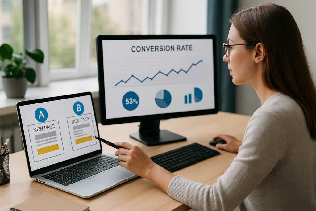
Testing Ideas on a New Page Safely
It’s a risky idea to make changes directly to your live homepage because you might accidentally make conversions worse. That’s why a safer way is to test a new version on a separate page to see if it works better. Then you can make the change permanent for all visitors.
As it turns out, when you test small, you can maintain your focus and avoid any expensive mistakes.
Ready for an explanation on how to do it? Here you go.
Creating a Test Version of Your Homepage
First, copy your current homepage and make one specific change to the new version. For example, you can try a different headline, change your button colour from blue to orange, or move your testimonials higher up the page.
Only change one thing at a time, so you know what caused any improvement or decline.
Directing a Small Amount of Traffic
Send a small portion of your traffic to the test page through an email campaign, social media post, or paid ad. Then compare how many people take action on the test page versus your original homepage.
If the test page converts better, you can confidently make that change to your main site.
Start Building Your High-Converting Homepage Today
An effective homepage should get better over time as you learn what works for your visitors. It must have a strong foundation, be persuasive and accessible, and keep improving as time goes on.
In this article, we’ve explained various elements of a good homepage, including headlines and clear call-to-action buttons. You’ve also learned how to build trust through social proof and optimise your site for mobile users. Plus, how you can test changes safely to increase your conversion rates without risking your current performance.
Our Free Website Evaluation at DPRConference can help identify quick improvement opportunities on your current homepage. Contact our team today to get started.